ONEngine

Unified disparate systems, led a team of 3 designers, and managed stakeholder expectations all while building a design first environment.

Role
UX Team Lead
Time Period
Jan 2024 - Present
Resposibilities
  • Workflow creation
  • Feature planning
  • Mentorship
  • Achievements
  • Utilized information architecture to combine 2 disparate systems.
  • Set up foundations for a design first company.
  • Helped junior designers grow into more advanced roles.
  • Time Period
    Bottom Text

    Work Overview

    As the UX lead at ONEngine, I’m responsible for overseeing our fledgling UX team, and designing the Work Orders component of our B2B SaaS application. Along with the challenges that come along with building a team from the ground up and attempting to institute design first principles at a company where none existed before, I also have the unique challenge of dealing with a very unique individual stakeholder. This stakeholder is simultaneously mercurial but also very attached to their way of performing certain tasks, which introduces a lot of ambiguity and complexity that inhibits our ability to explore new solutions or make suggestions that would attempt to address known problems in the existing system. He also makes performing even the most rudimentary user research difficult, as he believes that his way of doing things is the correct way and that others who may use slightly different ways to achieve the same results are incorrect.

    Introductory Design Work

    When I first started at ONEngine, I gave myself three primary design related tasks:

    • Talk to everyone I could to better understand the business and user needs.
    • Read our internal Confluence documents to better understand business and user needs.
    • Perform a heuristic analysis on any existing systems that were in place.

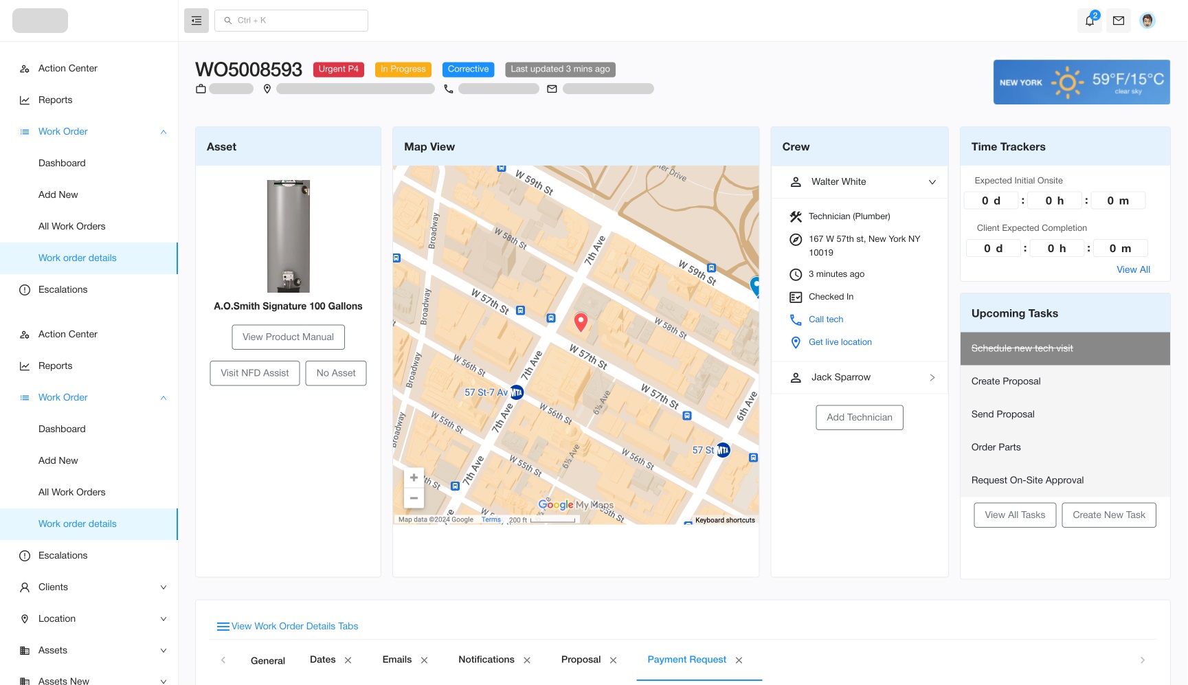
    While all of these tasks were helpful, the one that stood out to me was the heuristic analysis. It turns out that there were two systems in place, with one system being used day to day, while the other one was highlighed as what the primary stakeholder wanted to use as design inspiration. Some of the violations included:

    • Aesthetic & Design: Both systems had major design violations. Some pages would have an almost overwhelming amount of information that would force a user with a smaller screen to scroll horizontally, while other pages would be almost empty, if not empty. One system hid relevant information behind a dropdown menu which would then open in tabs at the bottom of the page.
    • Visibility Of System Status: Pages with data have mysteriously empty fields with no indication as to whether they were optional or not.
    • Help & Documentation: There were active buttons that upon being clicked would seemingly do nothing, and when I inquired about them I was told that they would only generate an outcome if certain prerequisites had been met. Said prerequisites were never mentioned anywhere in the system.
    • Flexibility & Efficiency of Use: The information architecture in both systems was subpar, and accessing key information was especially hard in the second one.
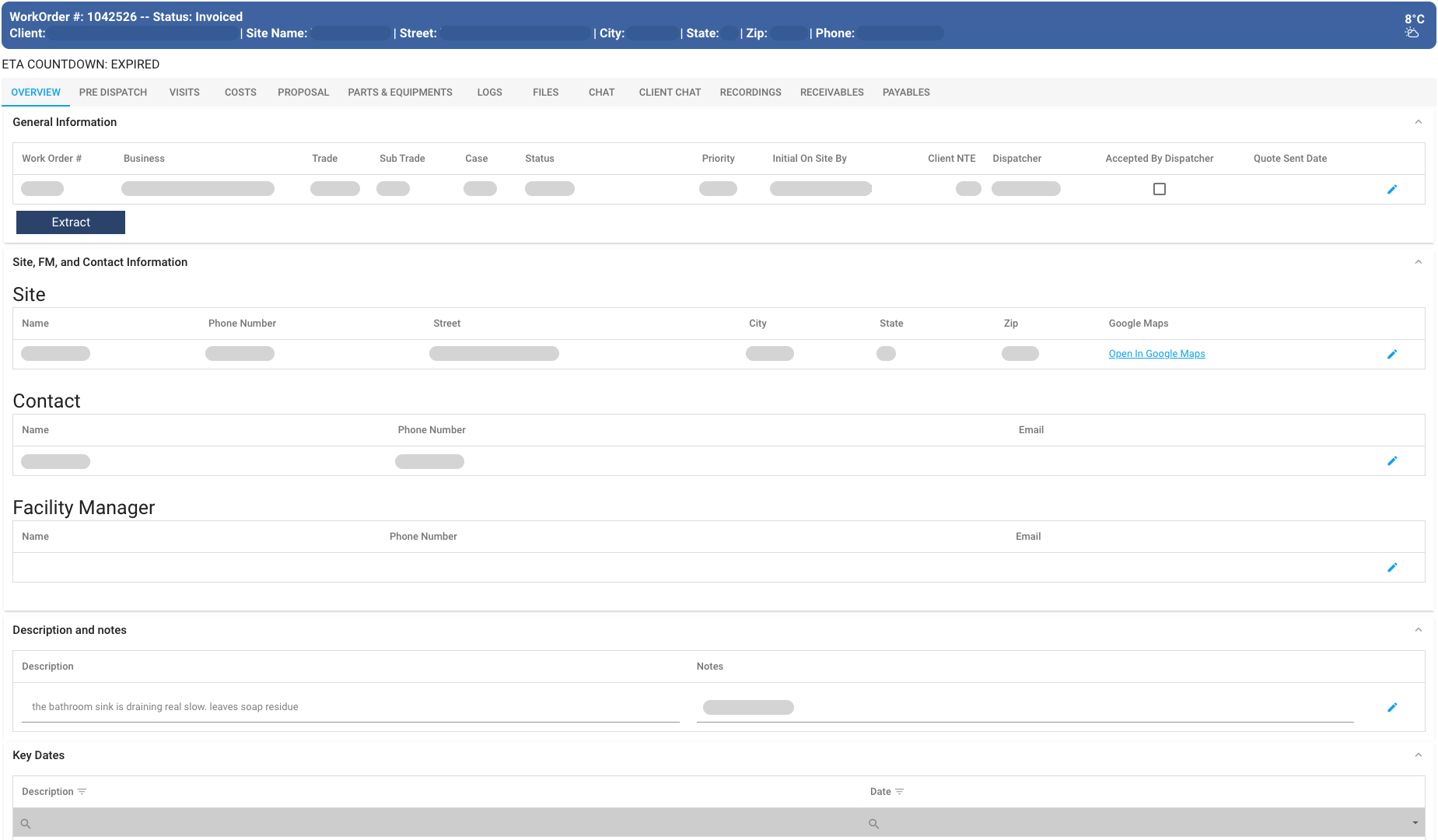
    Screenshot of the first system that was in use. Information architecture was better than the other one, but lots of pages had missing information.Screenshot of the first system that was in use. Information architecture was better than the other one, but lots of pages had missing information.
    Screenshot of the other system that wasn't being used. Note the tabs at the bottom of the page where the majority of relevant information is contained.Screenshot of the other system that wasn't being used. Note the tabs at the bottom of the page where the majority of relevant information is contained.

    Starting the Redesign & Initial Complications

    The first screen I started working on was the work order list view screen. This is one of the few times where I was able to talk with actual users of the existing software in order to identify what information was important to them. After reviewing their feedback, I built out a wireframe showing the basic layout of screens going forward. After quickly running it by everyone, I then created a work order overview page. However, after showing a preview to the stakeholder, he was unhappy and wanted major changes made to it, namely expanding the list to have more than 12 columns. To make matters worse, he insisted that this should be the default for everyone, not just him. After I scheduled additional meetings to identify why these changes were needed, I was able to identify three primary reasons for change:

    • He had an ultrawide screen and had the real estate to display all columns without scrolling, unlike the majority of the workers who would be using the system.
    • He viewed himself as a power user who needed all of the columns, despite not being able to clarify how often he used every single column.
    • He wanted new features added to the table that hadn’t been mentioned by the other existing users as being necessary or wanted.

    As a result of this, I ended up making some changes to the table in order to satisfy his demands. Those changes included:

    • Depending on the size of the screen, specific columns on both sides of the screen would be fixed even if the user scrolled left or right.
    • Adding a way to select what columns are shown in the table.

    During this time, I was able to start working on other areas of the application. For some areas of Work Orders, I was able to create vision decks in conjunction with PMs and other stakeholders, which helped to define why we were working on the feature, ground expectations as to what would be done in the initial sprint, and describe what would be done in future sprints. Below is a vision deck that I made for the Procurement feature.

    Fleshing Out Work Orders

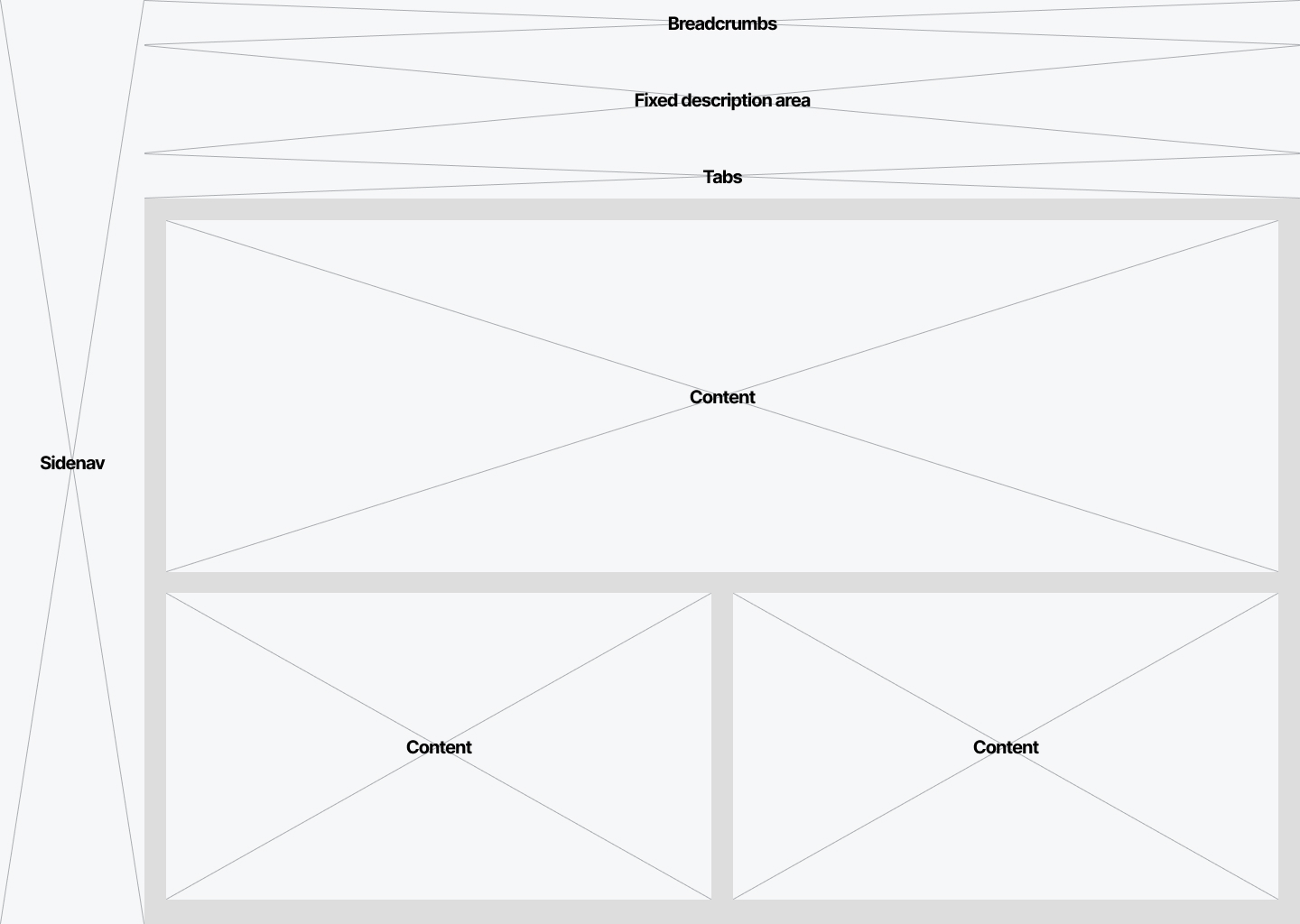
    The next step after building out the list view was to start working on the Work Order detail screens themselves. After reviewing the existing system and talking with the stakeholder and CTO about their goals for V0, I determined that they wanted a fixed area at the top to display key pieces of information, and then the body would contain tabs that would display relevant information. Unfortunately, while I wanted to get more feedback about the content of the work order page from the users we talked to earlier, the primary stakeholder made that very difficult, and as a result we weren’t able to talk to the users.

    Initial wireframe showing the layout of the Work Orders section.Initial wireframe showing the layout of the Work Orders section.

    After coming up with the basic wireframe layout for the Work Orders layout, I set out to build out each tab. For each tab, I worked with the stakeholder to identify what fields on the existing flow were needed, and if there was any information that he thought could potentially benefit users of the application. For portions of the application where we would interface with back-end engineers who were working with LLMs, I spent a fair amount of time talking with them and building flows in order to ensure that what I made could actually be built.

    Quick flow made to align stakeholders around the Work Order Proposal section.Quick flow made to align stakeholders around the Work Order Proposal section.

    Working with the primary stakeholder continued to be frustrating. He would frequently expand the scope of a tab to a point where it would lead to serious UX and engineering issues, would want one feature on one day but would want it removed on day two, or a combination of both. For example, the current chat tabs could handle text only messages inside the work order itself as well as emails, but he wanted to expand that to revise the entire internal chat system to more closely resemble Slack, as well as add WhatsApp-esque functionality (media attachments, single and group text messages) to the system as well. Ultimately, a combination of myself and the CTO were able to talk him out of it due to the time it would’ve taken to develop on the backend, but this wasn’t before a lot of time was spent building the interface for this expanded chat feature. Below is an interactive prototype of the Work Orders flow.

    UX Team Lead Work

    Along with design work, I was also hired to help build out the UX team and promote design throughout the company. One of the first initiatives I took on was to ensure that we had a working design system as soon as possible. I knew that if we didn’t have a design system that we could utilize, our designs would look disjoined despite our best efforts. After looking over different options, I convinced the CTO to purchase the UI Prep design system. By spending a few hundred dollars upfront, we saved tens, if not hundreds of hours building out a design system from the ground up all while accessing multiple ready to use components and color palettes that we could customize and add onto as needed. Over time, the team and I have added onto the design system, and I act as a final reviewer who has to approve new elements.

    Something that I’ve enforced for all members of the team is the creation of vision statement decks when kicking off a new feature. I’ve found that the scope of a feature has a tendency to grow if there aren’t guardrails in place beforehand, and creating these documents is a great way to limit scope growth and gather buy-in from all stakeholders. Lastly, I’m responsible for interviewing and approving new hires. Since I’ve become the lead, the size of the team has doubled which has allowed us to take on more work. I've found being a leader to be rewarding as I enjoy helping others advance in their career.